This is probably one of the most exciting finds of my photographs being used in the big outside world and one of the best stories too:
Kate has been working hard for several weeks on a report on costs for early childhood care and education. Just before it was launched, she got sent through a proof of the front cover from the independent design agency and check out who was on the front cover!
Saturday, 5 December 2009
Saturday, 31 October 2009
Lance & Neth: Photos
Thursday, 29 October 2009
Testing Experience
Despite being in IT, I've never heard of Testing Experience, a magazine all about agile testing. I haven't read it yet either, but this photo of mine is used on page 2.

Click here to download the PDF.

Click here to download the PDF.
Saturday, 24 October 2009
Lance & Neth
 It was a proper autumnal day and Lance and Neth's wedding was a fantastic time. The road to today has been long and winding but it was an honour to be there today and share in it, both as a friend and as the official photographer. Thank you both.
It was my first solo wedding photography stint but it went well and it certainly helps having a photogenic couple. Once I've unpacked the main computer (we only moved house last Thursday so it was lucky I even found the camera amidst all the boxes) I will edit and upload a selection. As a quick preview, I've included one of my favourites.
Saturday, 29 August 2009
Dave Bixby
I took some photos last week for Dave who did a great gig at the Grey Horse in Kingston. Here's a mini-selection:




Check out his Facebook music page.


Check out his Facebook music page.
Tuesday, 14 April 2009
Lightbox Banners in iStockPhoto.com
On iStockPhoto, I use lightbox banners to help people go from one image to a collection of images (also called a lightbox). The banners can be placed anywhere from your profile description, your iStock blog or your image description.
The idea behind it is to encourage viewers of one picture to look at related pictures. Many people report an increase in sales using this technique and also, very occasionally, some kind soul will buy a whole set of images: guaranteed to bring a smile to your face and a few extra cents in your account.
It's a simple process, just follow these steps:
And voila! That's all you need...it's worth noting that using the above URL will cause a new window to open.
The idea behind it is to encourage viewers of one picture to look at related pictures. Many people report an increase in sales using this technique and also, very occasionally, some kind soul will buy a whole set of images: guaranteed to bring a smile to your face and a few extra cents in your account.
It's a simple process, just follow these steps:
- Create a lightbox and and add your images to it
- Take a note of the lightbox number. You can find it out by viewing one of your lightboxes and in the URL in your browser you will see something like this:
http://www.istockphoto.com/file_search.php?action=file&lightboxID=6067951
- Create a banner for your images. This should be a jpg picture. I find dimensions of 380 x 70 pixels works well
- Upload your banner onto the web. You may well have free hosting through your internet provider. Failing that, there are plenty of sites out there that will let you upload pictures for free.
- And now to bring everything together. In your Profile within iStockPhoto or in the image description, you need to use the following text (consisting of what is termed UBB codes: similar to HTML but with square brackets instead of angled ones), replacing the bits in red with your lightbox ID and the URL of your uploaded banner:
[url=http://www.istockphoto.com/file_search.php?action=file&lightboxID=6067951][img]http://www.mysite.com/picture.jpg[/img][/url]
And voila! That's all you need...it's worth noting that using the above URL will cause a new window to open.
Sunday, 29 March 2009
Popular Photography
Friday, 27 February 2009
Using the Pen Tool in Photoshop CS3
For isolations or creating masks, this fellow ( ) is your friend! It transformed the way I do isolations and gives you much more flexibility when creating effective masks. With the possible exception of the Quick Selection Tool in CS3 or above, there isn't anything comparable.
But, the pen tool is a pain to learn and understand properly so I thought I would try and put together a few key points which I found the most helpful whilst using it.
Use P to select the pen tool.
Click once to define your starting point. This will p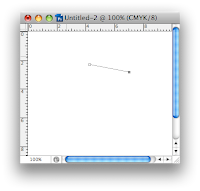 lace a solid grey anchor point.
Click once and release to create a straight line between your first click and second click.
The solid anchor point moves to your last click position.
Click and hold to create a curved line. As you hold the mouse button and move the pointer your curve will change shape. You will also see two additional 'anchor lines' which define how the curve is shaped. More on these a bit later. Release th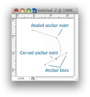 e mouse button when the curve is in the correct shape (or close to it).
You can repeat this process, creating an outline of straight or curved lines. When you click back on the original starting point the shape will become closed.
You can edit the shape as you go, or create the outline and then tweak it afterwards.
Moving an anchor point
To move an anchor point, hold down the option (cmd) key and click on an anchor point and drag it.
Changing the shape of a curve
Holding down the option (cmd) key and clicking on the path will select it and reveal the anchor lines.
For simple editing of a curve, hold down the option key and click and hold in the middle of a path. As you drag the mouse the curve will change shape.
For more control, the anchor lines are key to how the curve is formed. They can be moved by holding down the option (cmd) key and clicking on the end of the line (which has a small black dot). If you hold down the mouse button over the end of an anchor line and drag, you will move the anchor line and the curve will change shape.
Creating a corner
Few shapes consist entirely of curves. You will likely need some corners in there. Anchor points can either be an angle or part of a continuous curve.
Whilst initially creating our shape, if you clicked and released, you created a straight line and the anchor point creates an angle. If you clicked and dragged, you created a curved line and the anchor point is part of a continuous curve.
When part of a continuous curve, if you move one anchor line, the other moves in tandem with it to ensure the curve is smooth.
To break this relationship, hold down the ALT key and move one of the anchor lines. It will now move independently of the other line and you can create a corner instead of a curve.
Holding down the option (cmd) key and clicking on a path and dragging it will move that part of the path and alter its curve as you drag
Isolation Tips
General Path Tips
 ) is your friend! It transformed the way I do isolations and gives you much more flexibility when creating effective masks. With the possible exception of the Quick Selection Tool in CS3 or above, there isn't anything comparable.
But, the pen tool is a pain to learn and understand properly so I thought I would try and put together a few key points which I found the most helpful whilst using it.
Use P to select the pen tool.
Click once to define your starting point. This will p
 lace a solid grey anchor point.
Click once and release to create a straight line between your first click and second click.
The solid anchor point moves to your last click position.
Click and hold to create a curved line. As you hold the mouse button and move the pointer your curve will change shape. You will also see two additional 'anchor lines' which define how the curve is shaped. More on these a bit later. Release th
 e mouse button when the curve is in the correct shape (or close to it).
You can repeat this process, creating an outline of straight or curved lines. When you click back on the original starting point the shape will become closed.
You can edit the shape as you go, or create the outline and then tweak it afterwards.
Moving an anchor point
To move an anchor point, hold down the option (cmd) key and click on an anchor point and drag it.
Changing the shape of a curve
Holding down the option (cmd) key and clicking on the path will select it and reveal the anchor lines.
For simple editing of a curve, hold down the option key and click and hold in the middle of a path. As you drag the mouse the curve will change shape.
For more control, the anchor lines are key to how the curve is formed. They can be moved by holding down the option (cmd) key and clicking on the end of the line (which has a small black dot). If you hold down the mouse button over the end of an anchor line and drag, you will move the anchor line and the curve will change shape.
Creating a corner
Few shapes consist entirely of curves. You will likely need some corners in there. Anchor points can either be an angle or part of a continuous curve.
Whilst initially creating our shape, if you clicked and released, you created a straight line and the anchor point creates an angle. If you clicked and dragged, you created a curved line and the anchor point is part of a continuous curve.
When part of a continuous curve, if you move one anchor line, the other moves in tandem with it to ensure the curve is smooth.
To break this relationship, hold down the ALT key and move one of the anchor lines. It will now move independently of the other line and you can create a corner instead of a curve.
Holding down the option (cmd) key and clicking on a path and dragging it will move that part of the path and alter its curve as you drag
Isolation Tips
- Create your path 1 or 2 pixels inside of the shape you are outlining. This will lower the risk of any stray background pixels creeping into your isolation
- Don't feather more than 1 or 2 pixels
- Don't feel you need to use the pen tool entirely to create your isolation. Use a combination of techniques. For example, never use the pen tool for hair!
- For a quick isolation, a large depth of field is preferable so the outline of your object is entirely in focus. If the focus changes around the outline you will need to selectively blur the edge of your mask to make it look natural
General Path Tips
- As you create your path, Photoshop saves it under a 'work path'. Save your work path by double-clicking it and giving it a name. It will now be saved with your file. Failing to do this will lose all your hard work!
- You can quickly delete a point by pressing the delete key
Monday, 23 February 2009
Blue Flames
The Big Short Break
One of my favourite travel photographs has been featured in The Big Short Break by Ronald Asprey.

I haven't seen a copy of the book yet but reading the reviews on Amazon, the photography is meant to be fantastic!
The picture is from my trip to Angkor Wat in Cambodia in 2006. An awe-inspiring place and a remarkable and poignant contrast from the poverty in the rest of the country.

I haven't seen a copy of the book yet but reading the reviews on Amazon, the photography is meant to be fantastic!
The picture is from my trip to Angkor Wat in Cambodia in 2006. An awe-inspiring place and a remarkable and poignant contrast from the poverty in the rest of the country.
Labels:
cambodia,
tearsheet,
travel,
travel photography
Saturday, 31 January 2009
The FM Flash: Photo Shoot
"Captivating, unique, and extraordinary both visually and aurally; haunting music that masterfully combines delicate and intimate guitar melodies with epic, raw soundscapes set on an intricate foundation of bass and drums."
Thanks Dan, Dave, Joe and Dan.
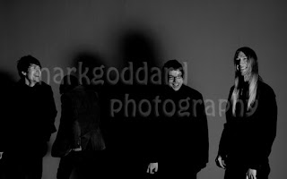
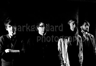
Outside the studio around the industrial estate, there were some great backgrounds. One of the best which we used had these large iron railings protecting the windows behind which were stacked a whole range of old computers. We deliberately set out to create some unusual lighting effects and used a mixture of light sources from the ambient light outside, some fill-in flash and a set of lead-lights as well as doing some long exposures and painting the light with a torch.
Wednesday, 28 January 2009
FM Flash
Had a photo shoot with a difference last night, taking some pictures for The FM Flash for some publicity material for one of their upcoming gigs. Photos to follow soon..
Stock Photography
One of the things that really got me into photography was by joining iStockPhoto. Click on the link below to go to my stock photography home page and browse my portfolio.
You can find an eclectic range of photographs there from concept shots to products to landscapes to design elements.
I will start to post some examples of where these pictures have been used in future blog entries.
You can find an eclectic range of photographs there from concept shots to products to landscapes to design elements.
I will start to post some examples of where these pictures have been used in future blog entries.
Subscribe to:
Comments (Atom)


